It probably did not seem like much, but I was not totally pleased with how the Tell Your Story logo had turned out. So back to Photoshop I went.
I made the yellow outline of each of the letters slightly more prominent so the outlines of the letters would seem more clear. That seemed to do the trick!
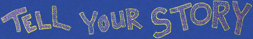
Here is the Original Logo
This logo originally took me about six hours to create. A seasoned graphic designer would attest to how long altering existing images can take – and would have taken far less time I am certain. It was done from a photo of the original tee shirt so was difficult to manipulate into being a header.
And Here is the Modified Logo
I wanted the yellow letter outlines to be more prominent. To accomplish this I needed to reduce the number of yellow shades to the brightest one present and widen the borders. Since this was originally a photo, the task was difficult as I did not want to alter anything other than the letter borders. I painstakingly moved along at a snail’s pace. It took me roughly five more hours of work to get it to here:
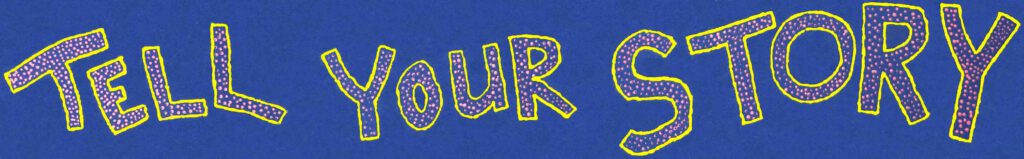
I’m more pleased with the new version. I’ve put it into the website’s header and I think it has improved the readability dramatically!
The Significance of This Logo
I’ve been asked what this logo is about – why it was made like it was – in short – what is its significance. If you check out the https://tellyourstory.ws/tell-your-story-by-charles-oropallo/ page, you will see that the text in the logo matches the “TELL YOUR STORY” text on the tee shirt displayed there. That’s no coincidence.
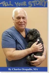
I created that tee shirt upon completion of therapy sessions held at the Veteran’s Administration for events related to my experiences in the United States Marine Corps boot camp at Parris Island, South Carolina. So I was very proud to have seen the therapy through – and that tee shirt is a symbol of my pride.